Home
Blocks
Templates
Config
Prefs
Block Bank
Blocks
20 stable blocks available
form
stable
Contact Form Cards
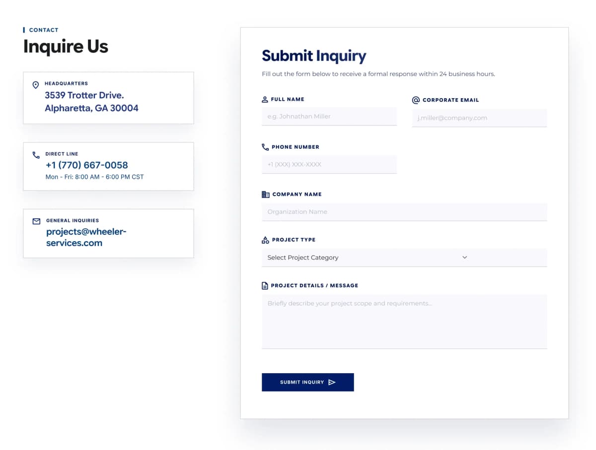
A two-column contact section: a left sticky sidebar with a header and up to 4 info cards (each linking to a map, phone, or email), and a right-side form panel rendered dynamically from a Payload Forms-plugin document. Fields, validation, and submit label all come from the linked form relationship — the block itself only supplies layout copy (tagline, title, panel title/description) and the contact cards. Ideal for a dedicated Contact page or a closing "get in touch" section.
npx cromatica-cli add block contact-form-cards
cta
stable
Cta Banner Contact
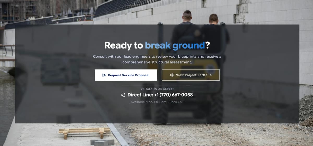
A full-bleed banner with a dark overlay over a background image, centered call-to-action content. Combines a rich-text-capable title (<span> support for gradient/accent words), a supporting subtitle, two side-by-side CTA buttons (primary filled / secondary outlined), and a WhatsApp-ready direct contact line below a divider. Ideal for closing sections — final consultation prompts, "get a quote" moments, or any high-intent conversion banner.
npx cromatica-cli add block cta-banner-contact
perks
stable
Items Selector Standard
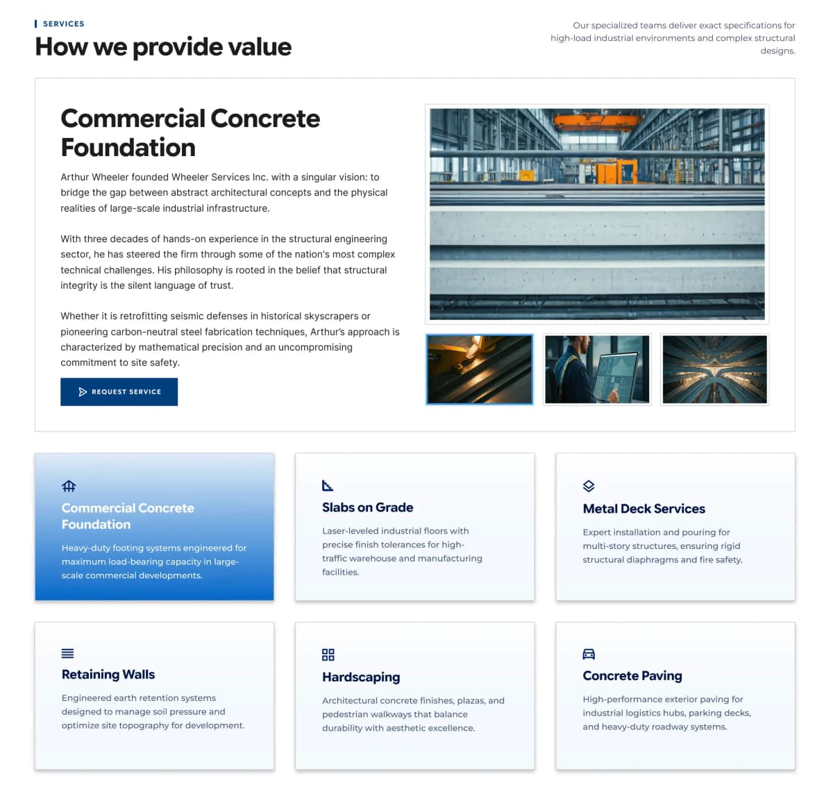
An interactive items showcase combining a card grid with a single detail panel. Selecting a card swaps the panel's title, description, CTA, and media (a main image plus up to 3 gallery thumbnails that open a fullscreen lightbox). A secondary extraInfo text sits beside the section header for supporting context. Ideal for service catalogs, capability lists, or any "select one, see detail" pattern — 1 to 8 items supported.
npx cromatica-cli add block items-selector-standard
hero
stable
Hero Card Standard
A full-width hero section with a background image (grayscale works well) and a left-aligned content card overlaid on top, marked with a blue left-accent border. The card holds a small uppercase tagline with an icon, a large title (supports HTML for gradient/colored text), and a short supporting description. Ideal as the top section of interior pages — services, about, or any page needing a strong titled intro over imagery.
npx cromatica-cli add block hero-card-standard
cta
stable
Cta Banner Standard
A full-width call-to-action banner with a background image and a left-aligned content column overlaid with a blue gradient. Shows a large title, a supporting description, and up to two action buttons (a solid primary CTA and an outlined secondary CTA). Ideal for closing sections that drive conversion — "request a proposal," "contact us," or end-of-page prompts.
npx cromatica-cli add block cta-banner-standard
other
stable
Timeline Items Five
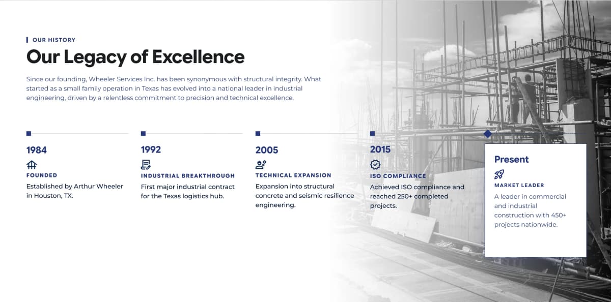
A section block that presents a company's history as a horizontal sequence of milestones over a full-bleed background image (grayscale works best). Each milestone shows a year/period label, an icon, a short title, and a description, connected along a horizontal line with node markers. Includes a header group (tagline, title, description). The final item is emphasized as the "present" state. Ideal for company history, "our legacy," or evolution narratives.
npx cromatica-cli add block timeline-items-five
cards
stable
Cards Grid Wall
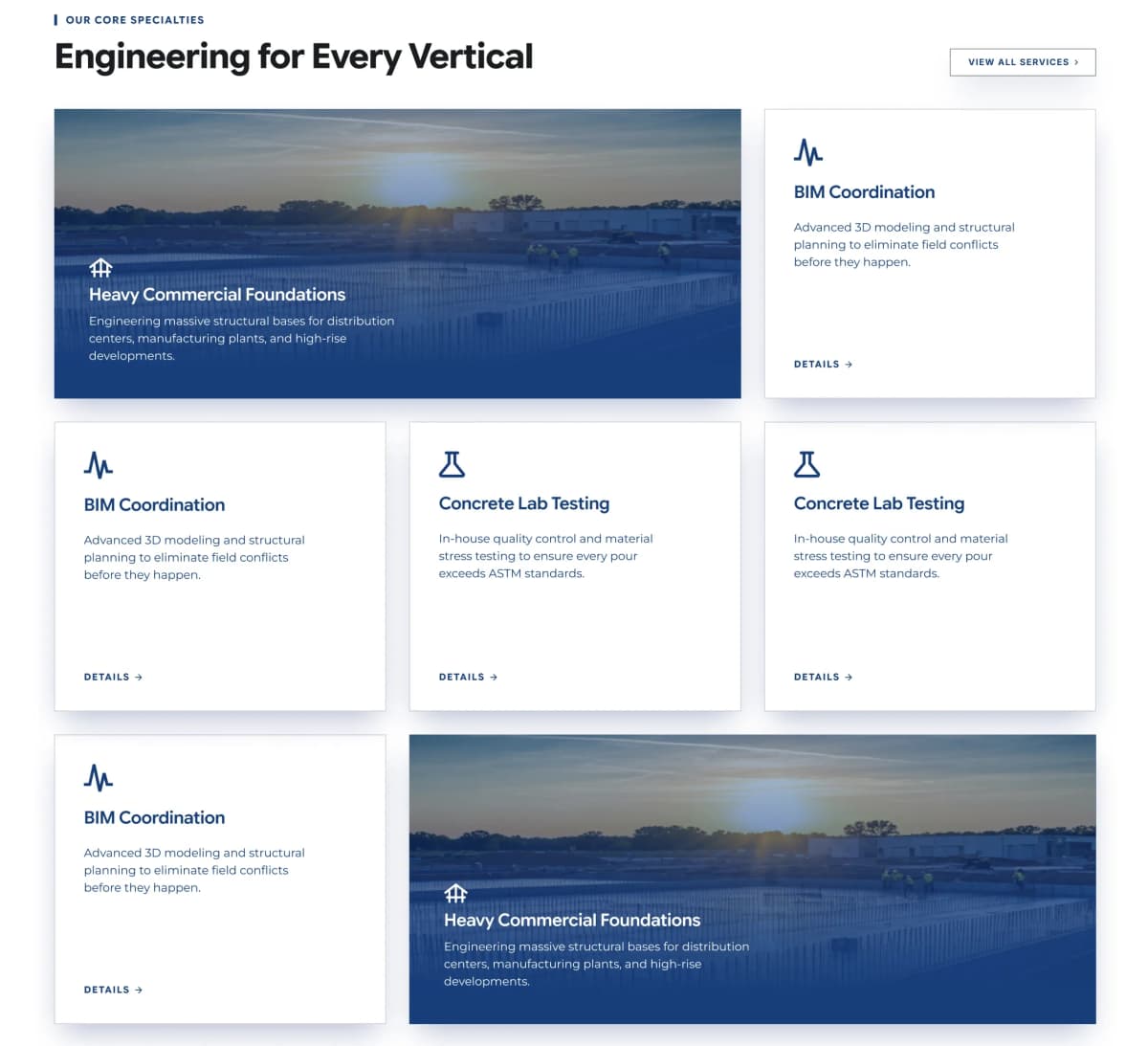
A section block presenting core services in an asymmetric bento-style grid. Cards come in two variants: featured cards that span wider and use a full-bleed background image with a dark overlay and light text (icon, title, description), and standard cards on a plain background with a colored icon, title, description, and a "Details →" link. Includes a header group (tagline, title) plus an optional top-right CTA (e.g. "View all services"). Each card links to its service detail. Ideal for showcasing service categories with visual emphasis on flagship offerings.
npx cromatica-cli add block cards-grid-wall
cards
stable
Statistics Cards Three
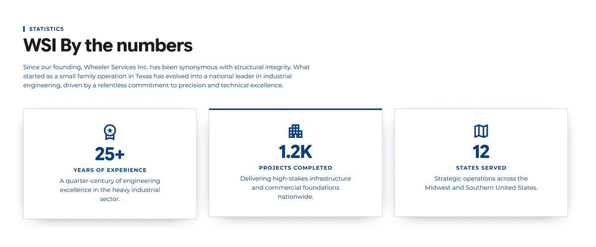
A section block that highlights key company metrics as a row of informative cards. Each card contains an icon, a large highlighted figure (e.g. "25+", "1.2K"), an uppercase label, and a short supporting description. Includes a header group (tagline, title, description) above the cards. Cards are managed via a repeatable array (designed for 3). Ideal for "by the numbers" / credibility sections.
npx cromatica-cli add block statistics-cards-three
Previous
1
2
3
Next