Home
Blocks
Templates
Config
Prefs
Block Bank
Blocks
20 stable blocks available
cta
stable
Banner Block Header
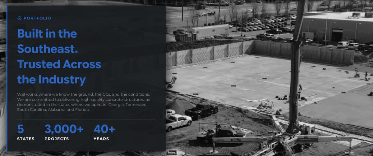
A full-bleed grayscale background image with a left-aligned, elevated card overlay: an icon + uppercase tagline, a bold title (rawHtml-capable for colored/gradient spans), a supporting description, and a stats row below a divider (big highlighted number + uppercase label, up to a few items). Similar intent to News Banner, but with the content boxed in a card rather than floating directly over the image, and positioned left instead of centered. Good for portfolio/projects-page intros establishing scale and geographic reach.
npx cromatica-cli add block banner-block-header
cta
stable
Banner Items Stats
A full-bleed dark-overlay banner pairing a bold title + supporting description on the left with a grid of up to 4 stat callouts (big number + label) on the right. No CTA, no form — a pure credibility/authority statement. Ideal for section breaks between content blocks, reinforcing scale and track record (years in business, projects completed, etc.) without asking for any action.
npx cromatica-cli add block banner-items-stats
other
stable
Headquarters Map
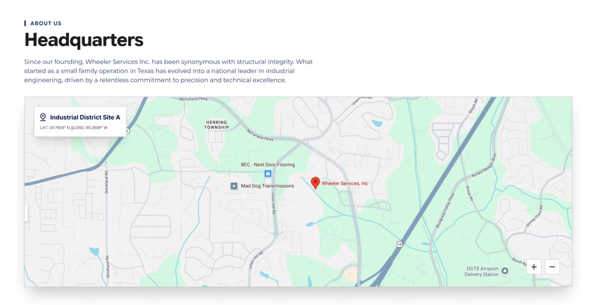
A header (tagline/title/description) with an optional CTA button, paired with an interactive Leaflet map below showing a single pinned location. An overlay card on the map displays a location label and coordinates; the marker itself carries its own title/popup text. Latitude, longitude, and zoom are all editor-controlled. Ideal for a Contact or About page section pinpointing a physical office or job site.
npx cromatica-cli add block headquarters-map
gallery
stable
Gallery Images Standard
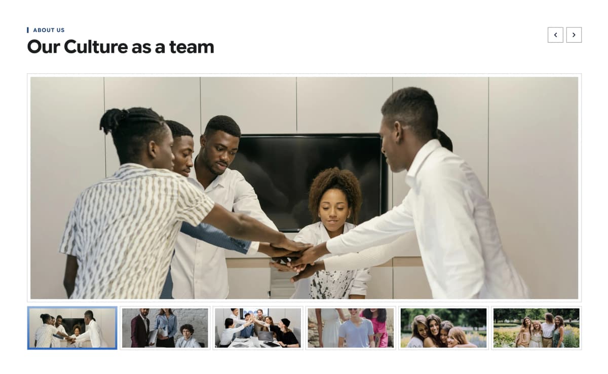
A large featured image with a row of clickable thumbnails below it (1–12 images); clicking a thumbnail swaps the main view, with prev/next arrows in the header for sequential browsing. Simpler than Success Cases — no cards, no detail panel text, just photography. Ideal for culture/team pages, behind-the-scenes content, or job-site photo essays.
npx cromatica-cli add block gallery-images-standard
other
stable
Our Team Members
A photo-grid team showcase pulling from the ourTeam collection via a hasMany relationship, letting editors pick and reorder which members appear per page. Each card leads with a large portrait, then a footer with role (tagline), name, and contact/social links. Ideal for "About Us" or leadership pages; the underlying member records also carry full bio, skills, and social links for reuse elsewhere (e.g. individual profile pages).
npx cromatica-cli add block our-team-members
other
stable
Vision Mision Standard
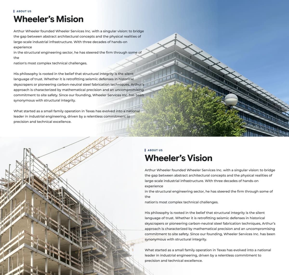
Two full-bleed, alternating content sections (mission then vision), each pairing a tagline/title/body-text column with a large background image on a diagonal-clip layout. Text and image sides swap between the two sections for visual rhythm. Ideal for "About Us" pages needing a strong editorial statement on company philosophy and long-term direction.
npx cromatica-cli add block vision-mision-standard
perks
stable
Case Selector Items
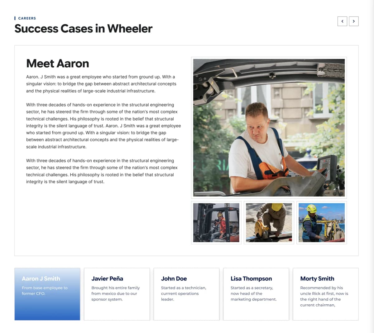
A people-focused selector: a horizontal card row (name + one-line subtitle) with prev/next arrow navigation in the header, paired with a detail panel showing the full story, a main image, and up to 3 gallery thumbnails. Structurally identical to Items Selector Standard, but scoped to person-centric content — employee spotlights, client testimonials, or team success stories — rather than services. Supports 1–5 cases.
npx cromatica-cli add block case-selector-items
other
stable
Faqs Items Accordions
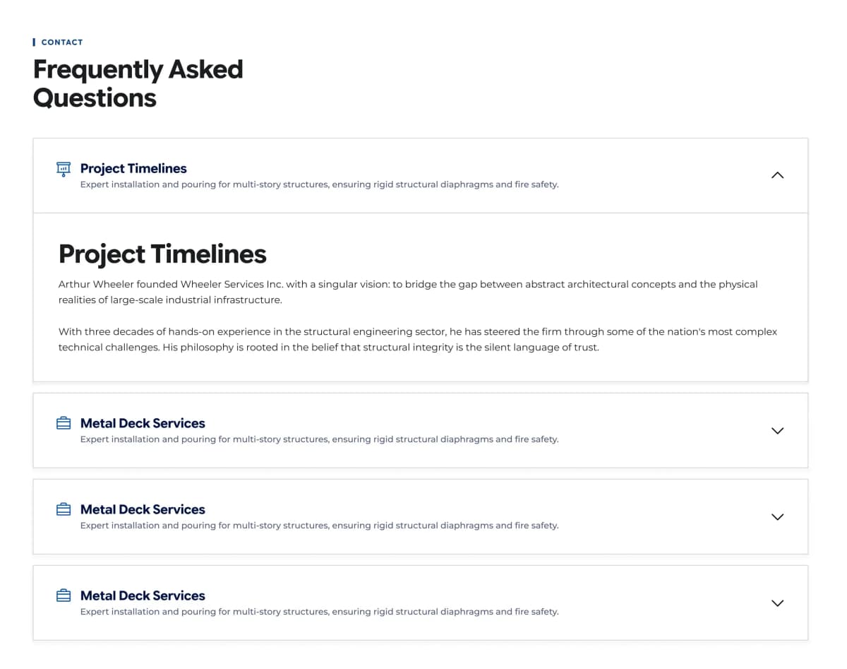
A stacked list of collapsible question/answer items (1–12), each with an icon, a short title + one-line description in the collapsed header, and full-text content revealed on expand. Supports double line breaks for multi-paragraph answers. Ideal for support/contact pages, service clarifications, or objection-handling sections near a CTA.
npx cromatica-cli add block faqs-items-accordions
Previous
1
2
3
Next